A New Way to Round the Corners of CSS Shapes
The polygon() value of clip-path accepts a new (optional) corner-rounding parameter that allows you to create curved and rounded shapes easily!
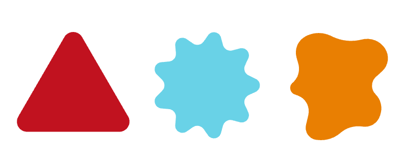
The code is as simple as the one below.
.shape {
  clip-path: polygon(round 20px, /* your shape */);
}
You can also specify a very large value to achieve maximum rounding of the shape. Each corner has a maximum value that you cannot round above. The logic is the same as with border-radius for creating circles or pills.
.shape {
  clip-path: polygon(round 9e9px, /* your shape */);
  /* OR  */
  clip-path: polygon(round calc(infinity * 1px), /* your shape */);
}
⚠️ Chromium-only for now ⚠️
See the Pen Rounding CSS Shapes using polygon() by Temani Afif (@t_afif) on CodePen.
Until better support, we can still use other techniques, such as mask combined with gradients or shape(). Find most of the shapes within my online collection.
More CSS Tips
- Responsive CSS Grid Layout with Animation A responsive grid with a smooth animation when the layout is updated.
- background-clip is getting an upgrade! Learn about the new values of the background-clip property.