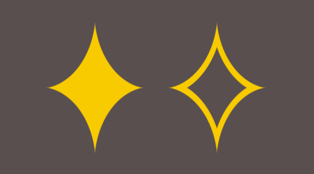
A Sparkle shape with one gradient
How much code is needed to create a Sparkle shape? ✨
Only one gradient and you can easily get the border-only variation.
.sparkle {
  background:
    radial-gradient(#0000 71%,#F8CA00 72% var(--_b,))
    10000% 10000%/99.5% 99.5%;
}
.border {
  --b: 10px; /* control the thickness */
  --_b: calc(71% + var(--b)),#0000 calc(72% + var(--b));
}
See the Pen Sparkle shape with one gradient by Temani Afif (@t_afif) on CodePen.
And if you consider mask you can have a gradient coloration
.sparkle {
  background: linear-gradient(45deg,#F8CA00,#fe7496);
  mask:
    radial-gradient(#0000 71%,#F8CA00 72% var(--_b,))
    10000% 10000%/99.5% 99.5%;
}
.border {
  --b: 10px; /* control the thickness */
  --_b: calc(71% + var(--b)),#0000 calc(72% + var(--b));
}
See the Pen Sparkle shape with gradient coloration by Temani Afif (@t_afif) on CodePen.
More CSS Shapes: css-shape.com
More CSS Tips
- No more pixel rounding issues! One line of code to fix all your pixel rounding issues.
- CSS-only background patterns with a minimal code The biggest collection of CSS patterns. One-click to get the code.
- The shortest selector for the root element Only one character is needed to target the html element.
- Avatar with status indicator A few lines of code to add a status indicator to any image.