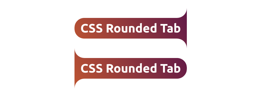
Vertical rounded tabs using CSS mask
Updating the previous rounded tab shape to create the vertical version using the same code structure.
- No extra element & No pseudo-element
- One variable to control the curvature
- Works with gradient coloration
- Powered by CSS mask
.rounded-tab {
  --r: .8em; /* control the radius/curvature */

  border-block: var(--r) solid #0000;
  border-radius: var(--r) 0 0 var(--r)/calc(2*var(--r));
  mask:
    radial-gradient(var(--r) at 0 var(--r),#0000 98%,#000 101%)
      100% calc(-1*var(--r))/var(--r) 100% repeat-y,
    conic-gradient(#000 0 0) padding-box;
}
.rounded-tab.alt {
  border-radius: 0 var(--r) var(--r) 0/calc(2*var(--r));
  mask:
    radial-gradient(var(--r) at 100% var(--r),#0000 98%,#000 101%)
      0 calc(-1*var(--r))/var(--r) 100% repeat-y,
    conic-gradient(#000 0 0) padding-box;
}
See the Pen Vertical rounded tabs using CSS mask by Temani Afif (@t_afif) on CodePen.
More CSS Shapes: css-shape.com
More CSS Tips
- Glowing border animation with a smooth stop Add a fancy border animation on hover that stops smoothly on mouseout.
- Full-bleed layout with modern CSS A few lines of code to make a section extend to the edges of the screen.
- Folded rectangle shapes using CSS mask Create a folded rectangle shape with minimal code and a subtle 3D effect.
- Indent each line of your text A new value of text-indent that allows you to indent each line of text.