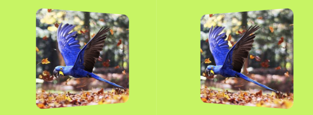
3D parallax effect on hover
After the previous effect, I am trying another concept of 3D parallax effect with a better illusion!
- No extra element (only the
<img>tag) - No pseudo-element
- Less than 15 CSS declarations

img {
  --s: 300px; /* the image size */

  width: var(--s);
  aspect-ratio: 1;
  box-sizing: border-box;
  padding-inline: calc(var(--s)/10) 0;
  object-fit: cover;
  border-radius: 20px;
  transform: perspective(350px) rotateY(calc(var(--_i,1)*10deg));
  transition: .5s;
}
img:hover {
  --_i: -1;
  padding-inline: 0 calc(var(--s)/10);
}
I am actually using 2 different images but only one image element is used in the code.
See the Pen 3D parallax effect on hover by Temani Afif (@t_afif) on CodePen.
More CSS Tips
- Indent each line of your text A new value of text-indent that allows you to indent each line of text.
- Select the last occurrence of an element in the whole document Select the last occurrence of any element in the whole document.
- Avatar hover effect with a rhombus shape Add a fancy hover effect to your image with a simple code.
- Inner display vs Outer display Learn the modern way to use the display property.