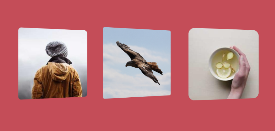
3D parallax effect on images
Add a fancy 3D effect to your image with a simple code
- No extra element (only the
<img>tag) - No pseudo-element
- No JavaScript
- Perfect 3D illusion on hover 🤩
img {
  --f: .1; /* the parallax factor (the smaller the better) */
  --r: 10px; /* radius */

  --_f: calc(100%*var(--f)/(1 + var(--f)));
  --_a: calc(90deg*var(--f));
  width: 250px; /* the image size */
  aspect-ratio: calc(1 + var(--f));
  object-fit: cover;
  clip-path: inset(0 var(--_f) 0 0 round var(--r));
  transform: perspective(400px) var(--_t,rotateY(var(--_a)));
}
img:hover {
  clip-path: inset(0 0 0 var(--_f) round var(--r));
  --_t:translateX(calc(-1*var(--_f))) rotateY(calc(-1*var(--_a)))
}
See the Pen 3D parallax effect on hover by Temani Afif (@t_afif) on CodePen.
More detail: smashingmagazine.com/2023/07/shines-perspective-rotations-css-3d-effects-images
More CSS Tips
- A Rhombus shape with rounded corners 3 lines of code to create a rhombus shape with rounded corners.
- Add a gradient overlay using border-image One line of code to add a gradient overlay above your background.
- A Ribbon title to the edge of the screen A magic border-image trick to add a ribbon shape to your title that extends to the edge of the screen.
- Full screen slanted background Only 2 properties to create a slanted background that extends to the edge of the screen.