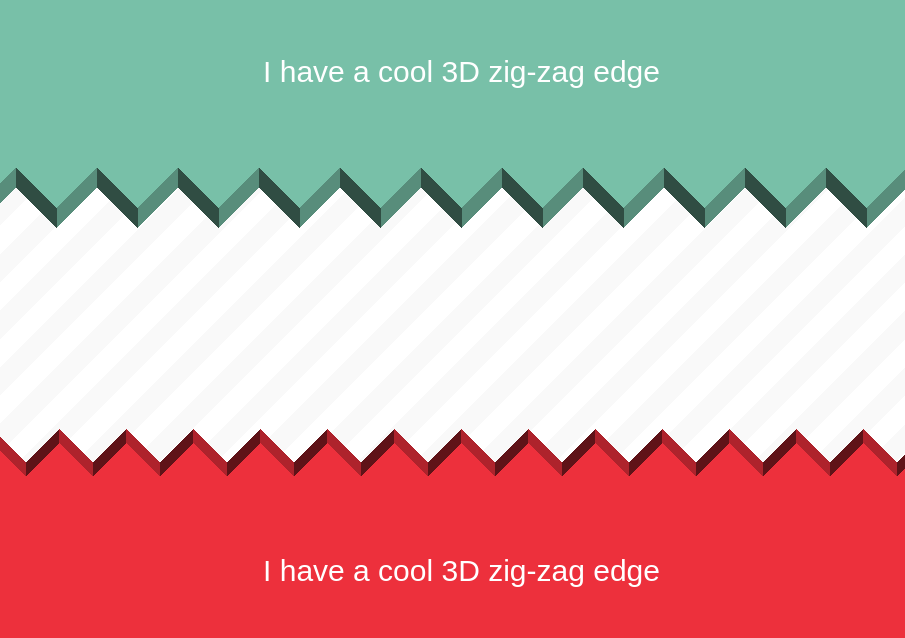
A CSS-only 3D Zig-Zag edge
Create a nice 3D Zig-Zag edge with a simple code:
- One element (No pseudo-element)
- Two gradients
- One color definition
- Optimized with CSS variables
.bottom {
  --_m: from 45deg at bottom;
  padding-bottom: var(--s);
  background:
    conic-gradient(var(--_m) var(--d) left 50%,
      #0004 135deg,#0009 0 270deg,#0000 0)
    50%/var(--s);
}
.top {
  --_m: from -135deg at top;
  padding-top: var(--s);
  background:
    conic-gradient(var(--_m) var(--d) left 50%,
      #0009 135deg,#0004 0 270deg,#0000 0)
    50%/var(--s);
}
.top,
.bottom {
  --s: 81px; /* control the size */
  --d: 20px; /* control the depth */

  mask: conic-gradient(var(--_m),#0000 75%,#000 0) 50%/var(--s);
  background-color: #ED303C; /* the main color */
}
See the Pen CSS-only 3D zig-zag edge by Temani Afif (@t_afif) on CodePen.
More CSS Shapes: css-shape.com
More CSS Tips
- A reveal hover effect with a single element Add a reveal animation to your image with a minimal code.
- A fancy hover effect with rotating squares Transform your image into little rotating squares with a fancy hover effect.
- Customize your numbered list A simple CSS trick to customize your ol list.
- CSS-only custom range slider Use CSS mask to create a border-only tooltip with a gradient coloration.