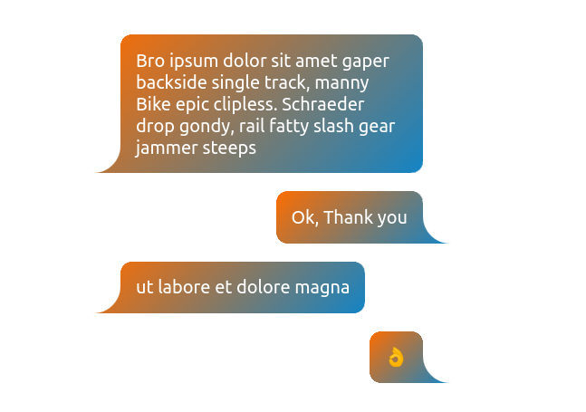
A CSS-only Speech Bubble
Create a Speech Bubble using a few lines of code
- One element
- No pseudo-element
- Only 3 CSS properties
- Optimized with CSS variables
.bubble {
  --r: 1rem;   /* the radius */
  --t: 1.5em;  /* the size of the tail */

  border-inline: var(--t) solid #0000;
  border-radius: calc(var(--r) + var(--t))/var(--r);
  mask:
    radial-gradient(100% 100% at var(--_p) 0,#0000 99%,#000)
      var(--_p) 100%/var(--t) var(--t) no-repeat,
    linear-gradient(#000 0 0) padding-box;
}
.left {
  --_p: 0;
  border-bottom-left-radius: 0 0;
}
.right {
  --_p: 100%;
  border-bottom-right-radius: 0 0;
}
See the Pen CSS only Speech Bubble by Temani Afif (@t_afif) on CodePen.
More Speech Bubble shapes: css-generators.com/tooltip-speech-bubble
More CSS Tips
- A fancy hover effect using outline Use outline to create a simple but nice hover effect.
- Zig-Zag expanding image panels Use mask and Flexbox/CSS grid to create a zig-zag expanding image panels.
- Put a number inside boxes A few tricks to make your number look fancy.
- CSS-only back to top button A few CSS trick to create a back to top button.