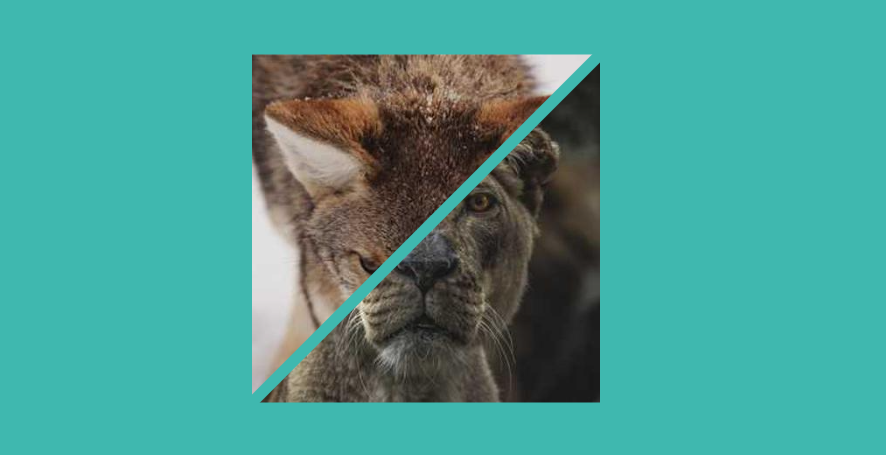
Diagonal split & reveal animation
Reveal your images with a cool hover effect using a few lines of code
- Minimal HTML (2
<img>inside a container) - Less than 15 CSS declaration
- Optimized with CSS variables
.gallery {
  --g: 8px; /* the gap */

  display: grid;
}
.gallery > img {
  --_p: calc(-1*var(--g));
  grid-area: 1/1;
  transition: .4s .1s;
}
.gallery > img:first-child {
  clip-path: polygon(0 0, calc(100% + var(--_p)) 0 , 0 calc(100% + var(--_p)))
}
.gallery > img:last-child {
  clip-path: polygon(100% 100%, 100% calc(0% - var(--_p)), calc(0% - var(--_p)) 100%)
}
.gallery:hover > img:last-child,
.gallery:hover > img:first-child:hover{
  --_p: calc(50% - var(--g));
}
.gallery:hover > img:first-child,
.gallery:hover > img:first-child:hover + img{
  --_p: calc(-50% - var(--g));
}
See the Pen Dual image with hover effect by Temani Afif (@t_afif) on CodePen.
More detail: css-tricks.com/css-grid-and-custom-shapes-part-3
More CSS Tips
- A fancy title divider Use background and border-image to create a fancy title divider.
- A fancy hover effect using outline Use outline to create a simple but nice hover effect.
- Custom dashed border Use gradient and CSS mask to create a dashed border.
- Put a number inside boxes A few tricks to make your number look fancy.