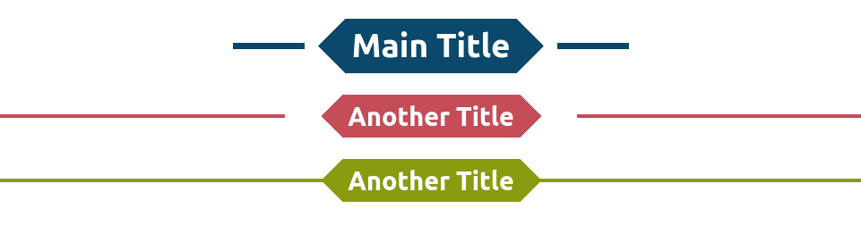
A fancy title divider
Turn your titles into a fancy divider using few lines of code
- No extra element
- No pseudo element
- No overflow issue
- Easy to update using CSS variables
.fancy {
  --b: 6px;   /* control the border thickness */
  --w: 80px;  /* control the width of the line*/
  --g: 15px;  /* control the gap */
  --c: #0B486B;

  background:
    conic-gradient(from   45deg at left ,var(--c) 25%,#0000 0) 0,
    conic-gradient(from -135deg at right,var(--c) 25%,#0000 0) 100%;
  background-size: 51% 100%;
  background-repeat: no-repeat;
  border-image:
     linear-gradient(
       #0000      calc(50% - var(--b)/2),
       var(--c) 0 calc(50% + var(--b)/2),
       #0000    0)
    1/0 var(--w)/calc(var(--w) + var(--g));
}
See the Pen Fancy title divider with one element by Temani Afif (@t_afif) on CodePen.
More CSS Tips
- Cut the corners of your element Use CSS mask to cut the four corners of an element with a circular shapes.
- A CSS-only Zig-Zag edge Use CSS mask to create an easy to adjust Zig-Zag edge/border.
- Zig-Zag expanding image panels Use mask and Flexbox/CSS grid to create a zig-zag expanding image panels.
- Diagonal split & reveal animation Use clip-path to create a nice hover effect to reveal images.