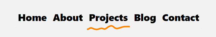
Hand-Drawn Underline using border-shape
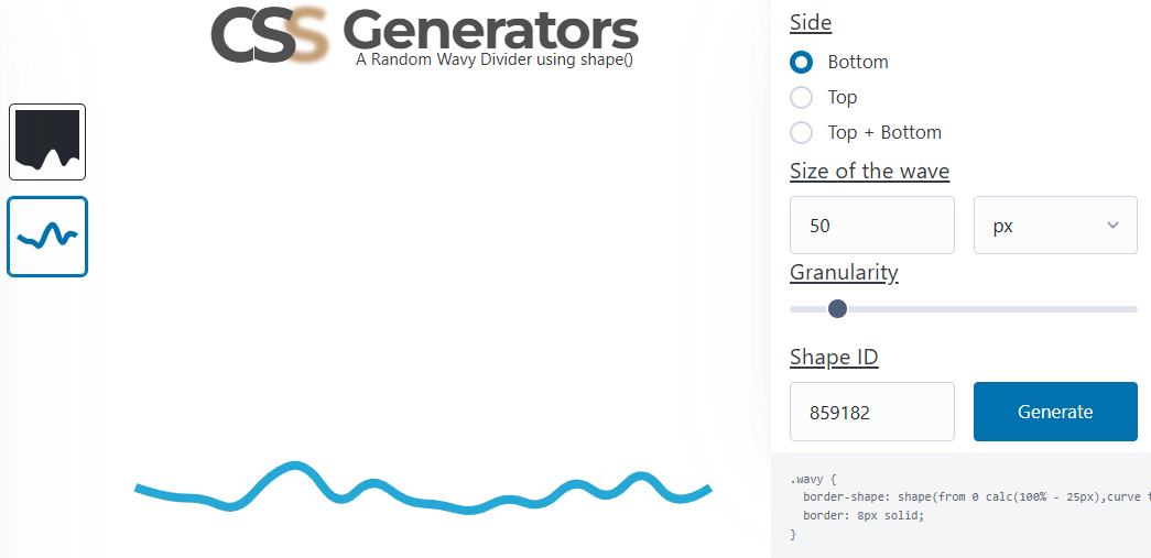
Use the new border-shape property and transform the classic underline into hand-drawn lines! It works with a simple code, and you can easily generate the wavy shape using my online generator
ul {
  padding: 0 0 20px;
  border-bottom: 6px solid #fb8500;
  border-shape: shape(/* code from the generator */);
  clip-path: inset(0);
}
ul:after {
  content: "";
  position: absolute;
  position-anchor: --a;
  inset: anchor(outside) anchor(inside) 0;
  border-image: conic-gradient(#f2f2f2) 1/0 100vw/0 100vw; /* the color used here must match the background color */
  transition: .2s;
}
ul li a:is(:hover,[aria-current],:focus-visible) {
  anchor-name: --a;
}
ul:has(a:is(:hover,:focus-visible)) a:not(:hover,:focus-visible) {
  anchor-name: none;
}
border-shape is a Chrome-only feature for now. You will get a classic underline in the other browsers.
See the Pen Hand-Drawn Underline using border-shape by Temani Afif (@t_afif) on CodePen.
To change the shape, select the border-only version and the bottom side from the generator, then adjust the other values like you want (granularity, size, and shape ID). The padding-bottom of the ul needs to be equal to the size value, and to control the line's thickness and color, simply adjust the border property.
More CSS Tips
- Control the Speed of Infinite Animations A simple code to easily control the speed of any infinite animation.
- The Lazy Tooltip Follower A fun demo illustrating a tooltip that follows its anchor, but slowly.
- Let's Reshape the Web using border-shape! A new property to easily create CSS shapes while preserving borders, shadows, outlines, etc.
- A Sliding "Liquid Oozing" Reveal Effect A fancy reveal animation powered by clip-path: shape().