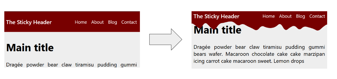
The Sticky Header that Sticks!
Creating a sticky header is an easy task with position: sticky. But what about a sticky header that sticks for real? By combining scroll-driven animation and shape(), we can achieve a nice effect with simple code.
header {
  position: sticky;
  top: 0;
  animation: stick linear both;
  animation-timeline: scroll();
  animation-range: 0px 45px;
}
@keyframes stick {
  0% {
    padding-block: 30px 30px; /* 30 + 30 = 60 */
    clip-path: shape(/* code from generator */);
  }
  to {
    padding-block: 5px 55px; /* 5 + 55 = 60 */
    clip-path: shape(/* code from generator */);
  }
}
See the Pen A Sticky Header that Stick! by Temani Afif (@t_afif) on CodePen.
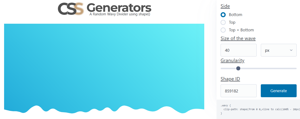
The shapes are generated using my wavy divider generator. Choose the bottom side, then fix the shape ID and the granularity. The first shape is the one with a size equal to 0 (rectangle), and the second shape will have a size different from 0. Having the same granularity (the same number of points) will allow the browser to transition smoothly between the two shapes.
More CSS Tips
- An Interactive Image Slider/Carousel Using modern CSS to create a responsive image slider with speed control.
- Control the Speed of Infinite Animations A simple code to easily control the speed of any infinite animation.
- Convert Complex SVG Shapes into CSS An SVG-to-CSS converter to easily transform SVG shapes into CSS shapes.
- Let's Reshape the Web using border-shape! A new property to easily create CSS shapes while preserving borders, shadows, outlines, etc.