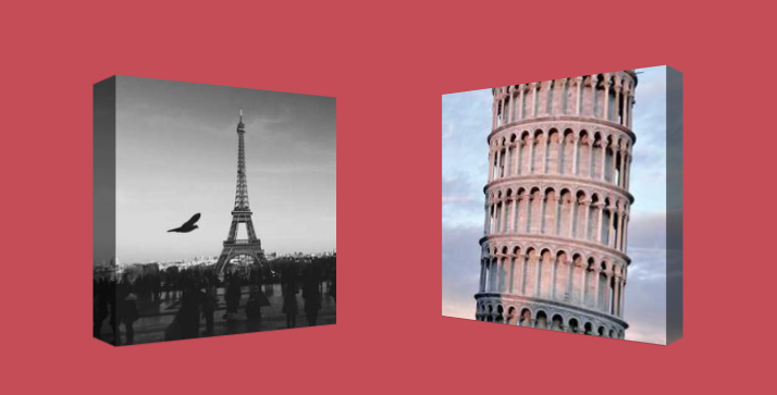
Transform a 2D image into a 3D one
Transform your 2D image into a 3D one using a few lines of code
- No extra element (only the
<img>tag) - No pseudo-element
- Nice animation on hover 🤩
img {
  --d: 18px;  /* the depth */
  --a: 20deg; /* the angle */

  /* the below value is based on the depth and the angle.
     the formula is a bit difficult to express so we update it manually
  */
  --x: 10px;

  width: 250px; /* control the size */
  aspect-ratio: 1.1; /* you can use 1 as ratio but I found 1.1 a little better */
  padding-block: var(--d);
  transform: perspective(400px) rotateY(calc(var(--_i,1)*var(--a)));
  outline: var(--d) solid #0008;
  outline-offset: calc(-1*var(--d));
  --_d: calc(100% - var(--d));
  --_l: 0px;
  --_r: 0px;
  clip-path: polygon(
    var(--_l) calc(var(--_d) - var(--x)),
    var(--_l) calc(var(--d)  + var(--x)),
    var(--d) var(--d),var(--_d) var(--d),
    calc(var(--_d) + var(--_r)) calc(var(--d)  + var(--x)),
    calc(var(--_d) + var(--_r)) calc(var(--_d) - var(--x)),
    var(--_d) var(--_d),var(--d) var(--_d)
   );
  transition: transform .3s,--_r .15s,--_l .15s .15s;
  transition-timing-function: linear;
}
img:hover {
  --_l: var(--d);
  --_r: var(--d);
  --_i: -1;
  transition-delay: 0s,.15s,0s;
}
See the Pen 3D images with hover effect by Temani Afif (@t_afif) on CodePen.
More detail: smashingmagazine.com/2023/07/shines-perspective-rotations-css-3d-effects-images
More CSS Tips
- 3D shine effect on hover A fancy 3D effect with a shiny animation on hover.
- A Rhombus shape with rounded corners 3 lines of code to create a rhombus shape with rounded corners.
- A folded ribbon to the corner Add a folded ribbon to the corner of your element with a simple code.
- A Ribbon title to the edge of the screen A magic border-image trick to add a ribbon shape to your title that extends to the edge of the screen.