A Modern way to create an octagon shape
An easy and modern way to create Octagon shapes
- Only 2 CSS declarations
- No magic numbers
- A 4-point polygon (instead of 8) for the clip-path
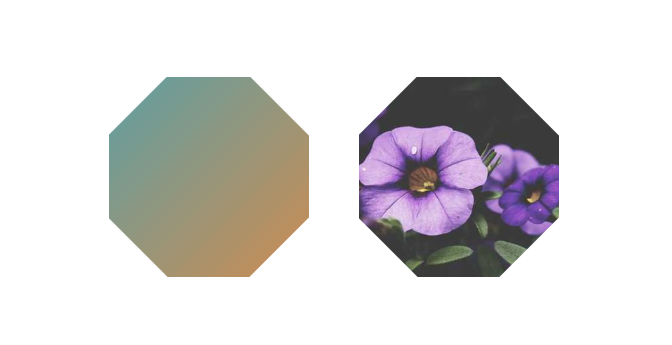
.octa {
  width: 200px;

  aspect-ratio: 1;
  --o:calc(50%*tan(-22.5deg));
  clip-path: polygon(
    var(--o) 50%,50% var(--o),
    calc(100% - var(--o)) 50%,
    50% calc(100% - var(--o))
  );
}
See the Pen CSS-only octagon shapes (the modern way) by Temani Afif (@t_afif) on CodePen.
More CSS Shapes: css-shape.com
More CSS Tips
- A curved ribbon shape with hover effect A simple ribbon shape with a fancy hover effect.
- A fancy frame with wavy borders (wavy box) Place your image inside a wavy box using modern CSS.
- Fix your images with an adhesive tape A fancy effect using only the image element and a few lines of code.
- Fancy corner decoration for your images A few lines of code for a cool corner decoration.