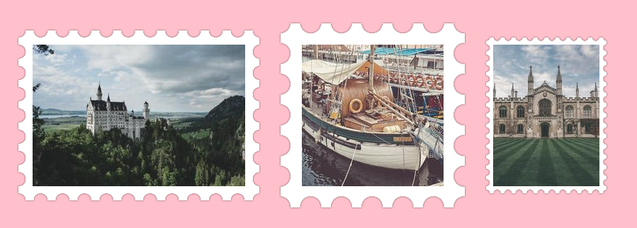
Turn an image into a postage stamp
Transform your image into a cool postage stamp with a few lines of code
- No extra element (only the
<img>tag) - Only two CSS gradients
- Works with any image size
- Easy to adjust using CSS variables
img {
  --r: 20px; /* control the radius of the circles */
  padding: var(--r);
  filter: grayscale(.4) drop-shadow(0 0 1px #0005) drop-shadow(0 0 1px #0005);
  background:
    radial-gradient(50% 50%,#0000 65%,#fff 67%) round
     var(--r) var(--r)/calc(2*var(--r)) calc(2*var(--r));
}
See the Pen CSS-only Stamp effect by Temani Afif (@t_afif) on CodePen.
More CSS Tips
- A CSS-only fragmentation effect Add a fancy fragmentation effect to images using CSS mask.
- Smoothly stop a rotation on hover A simple CSS trick to slowly stop a rotation on hover.
- The gotcha of align-content with block elements The new align-content won't center your content like you may expect.
- CSS Functions that work without arguments Some functions in CSS don't require arguments and it can be helpful.