Responsive Separator for Horizontal List
Separating a horizontal list of items with a divider is a common design pattern. The tricky part is making sure we have separators only between adjacent items, never at the beginning or the end of the row/line.
There are many hacky ways to solve this, but the new Gap Decoration feature offers a simple, modern solution. No more hacks and only a few lines of code to get the shape of the divider you want.
.vertical-line {
column-rule: 3px solid #c1121f; /* width = 3px */
rule-inset: calc(.5lh - .75em/2); /* height = .75em */
}
.horizontal-line {
column-rule: .75em solid #c1121f; /* width = .75em */
rule-inset: calc(.5lh - 4px/2); /* height = 4px */
}
.square {
--s: 10px; /* size */
column-rule: var(--s) solid #c1121f;
rule-inset: calc(.5lh - var(--s)/2);
}
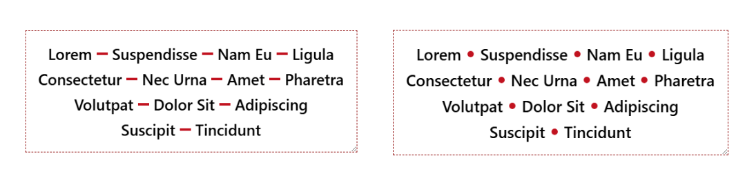
.circle {
--s: 10px; /* size */
column-rule: var(--s) dotted #c1121f;
rule-inset: calc(.5lh - var(--s)/2);
}Here is an interactive demo where you can adjust the alignment, resize the container, and see how the divider behaves.
⚠️ Chromium-only for now ⚠️
See the Pen Responsive Separator for Horizontal List by Temani Afif (@t_afif) on CodePen.
Until better support, check this: Responsive Separator for Horizontal List
More CSS Tips
- Dynamic Node Connection (CSS-only Diagram) Create a graph/diagram with different nodes and connections, all made with pure CSS.
- Bending a Straight Line using Modern CSS Using border-shape and anchor positioning to create a bending line between two circles.