Dynamic Node Connection (CSS-only Diagram)
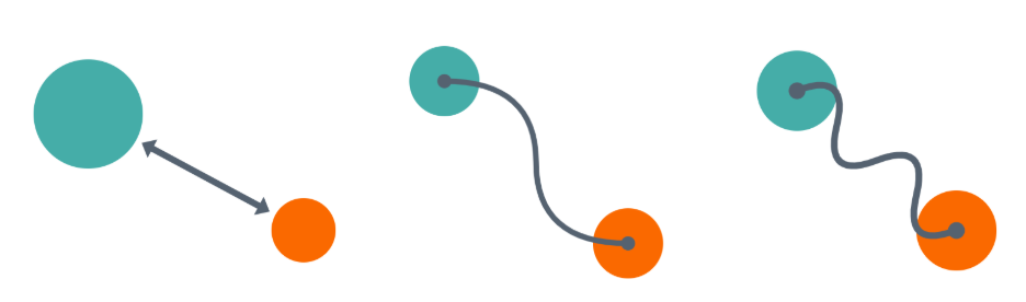
I shared various CSS tips showing how modern CSS can be used to create a dynamic connection between two elements. I connected two circles with an arrow, a curved line, a straight line that bends, etc.
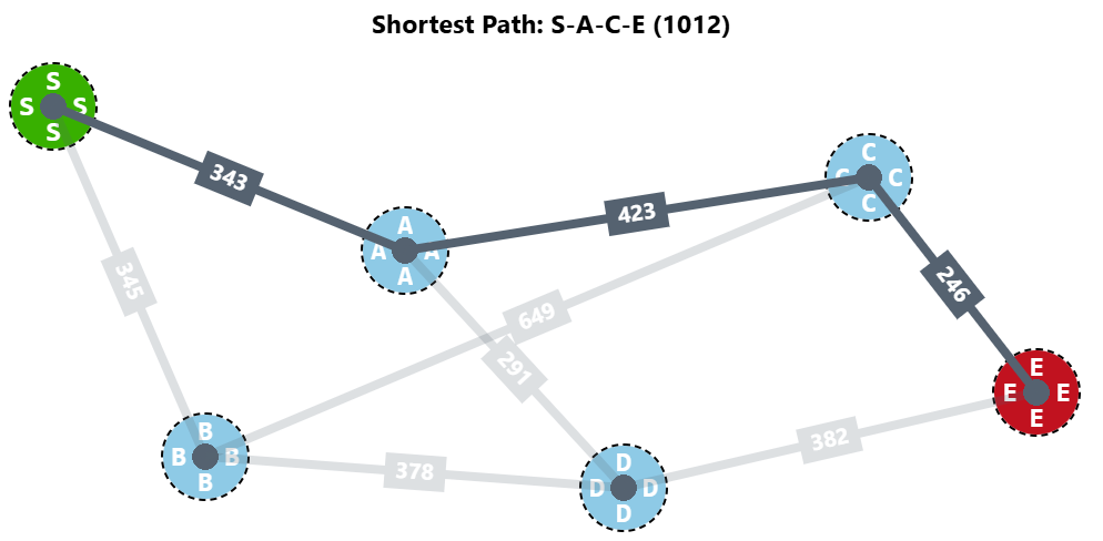
I even made a CSS-only graph with a shortest-path algorithm.
We can still do more and create a diagram like the one below. It's still a graph, but this time the nodes are square elements, and the connectors can have different shapes and positions based on the node's position!
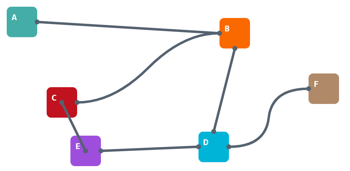
Here is a demo with two elements. Drag them around and see how the connection behaves. It will try to link the closest edges of both nodes, or their centers, if the distance between them gets smaller. Yes, there is a nice transition as well.
⚠️ Chrome-only for now ⚠️
See the Pen Dynamic node connection (drag the elements) by Temani Afif (@t_afif) on CodePen.
A demo packed with modern CSS features such as Anchor Positioning, border-shape, shape(), container queries, attr(), if(), and more!
<div class="box" name="--a" ></div>
<div class="box" name="--b" ></div>

<!-- add a connection between "--a" and "--b" -->
<div class="link" x="--a" y="--b">
  ...
</div>
.link {
--b: 10px; /* line thickness */
--s: 60px; /* the box sizes */
--d: 150px; /* control the curvature of the line */
--x: attr(x type(<custom-ident>));
--y: attr(y type(<custom-ident>));
}
.link * {
position: absolute;
--_x: calc(anchor(var(--x) inside) + anchor-size(var(--x))/2 - .1px);
--_y: calc(anchor(var(--y) inside) + anchor-size(var(--y))/2);
container-type: size;
}
.link :is(a,b) {top: var(--_x); bottom: var(--_y)}
.link :is(a,c) {left: var(--_x); right: var(--_y)}
.link :is(c,d) {top: var(--_y); bottom: var(--_x)}
.link :is(b,d) {left: var(--_y); right: var(--_x)}
.link *:before,
.link *:after {
content: "";
position: absolute;
inset: calc(-1*var(--b));
border: var(--b) solid #556270;
display: if(style(calc(sign(1cqw)*sign(1cqh)) = 0):none);
transition: .3s linear;
}
/* control when each shape is visible based on the distance between the boxes */
.link *:before,
.link *:after {
border-shape: if(
style((hypot(100cqw,100cqh) < 200px)):
var(--shape1);
style(((hypot(100cqw,100cqh) < 400px) or (100cqh < 200px)) and (100cqh < 100cqw)):
var(--shape2);
style(((hypot(100cqw,100cqh) < 400px) or (100cqw < 250px)) and (100cqh > 100cqw)):
var(--shape3);
else:
var(--shape4))
padding-box;
}
/* the shapes of the lines */
.link *:before {
--shape1: shape(from 0 0,curve to 50% 50% with 50% 50%,smooth to 100% 100%);
--shape2: shape(from var(--s) 0,curve to 50% 50% with 50% 50%,smooth to calc(100% - var(--s)) 100%);
--shape3: shape(from 0 var(--s),curve to 50% 50% with 50% 50%,smooth to 100% calc(100% - var(--s)));
--shape4: shape(from var(--s) 0,curve to 50% 50% with calc(var(--s) + var(--d)) 0,smooth to calc(100% - var(--s)) 100%);
}
/* the shapes of the dots */
.link *:after {
--shape1: shape(from calc(var(--b)/2) 0,arc by 0 .1px of calc(var(--b)/2) large,
move to calc(100% + var(--b)/2) 100%,arc by 0 .1px of calc(var(--b)/2) large);
--shape2: shape(from calc(var(--s) + var(--b)/2) 0,arc by 0 .1px of calc(var(--b)/2) large,
move to calc(100% - var(--s) + var(--b)/2) 100%,arc by 0 .1px of calc(var(--b)/2) large);
--shape3: shape(from calc(var(--b)/2) var(--s),arc by 0 .1px of calc(var(--b)/2) large,
move to calc(100% + var(--b)/2) calc(100% - var(--s)),arc by 0 .1px of calc(var(--b)/2) large);
--shape4: shape(from calc(var(--s) + var(--b)/2) 0,arc by 0 .1px of calc(var(--b)/2) large,
move to calc(100% - var(--s) + var(--b)/2) 100%,arc by 0 .1px of calc(var(--b)/2) large);
}
.link b {scale: -1 1}
.link c {scale: 1 -1}
.link d {scale: -1 -1}Even if the CSS looks a bit complex (I will be writing a detailed article to explain everything), the HTML structure is simple, which allows you to add as many elements/connectors as you want!
Open the demo below in full screen, drag the elements, and have fun!
See the Pen Untitled by Temani Afif (@t_afif) on CodePen.
More CSS Tips
- Wiggly/Wavy Input Range Slider II Adding a bouncy tooltip to the wiggly slider.
- Responsive Separator for Horizontal List Modern CSS solves a very old design pattern with a few lines of code.
- Connecting Circles With a Curved Line Using border-shape and anchor positioning to create a connection between two circles.
- Three Shape Variations using border-shape Use border-shape to create any shape, its border-only and cutout variations.