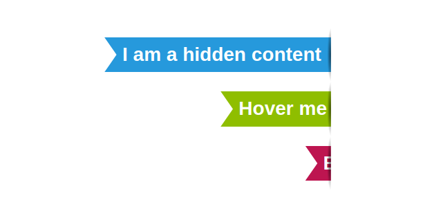
A Ribbon shape with a reveal hover effect
Create a ribbon shape with a fancy reveal effect on hover
- Only one element
- No fixed size (it fits your text content)
- Optimized with CSS Variables
@property --s {
  syntax: "<length-percentage>";
  initial-value: 0%;
  inherits: true;
}

.ribbon {
  --r: .8em; /* control the cutout */
  --s: 15%; /* control how much content is shown initially */

  margin-block: .5em;
  padding-inline: calc(var(--r) + .3em) .5em;
  clip-path: polygon(0 0,var(--s) 0,var(--s) 100%,0 100%,0 calc(100% - .25em),var(--r) 50%,0 .25em) margin-box;
  translate: calc(100% - var(--s));
  background: #2699dc padding-box;
  position: relative;
  transition: --s .8s linear;
}
.ribbon:before {
  content: "";
  position: absolute;
  inset: -.5em calc(100% - var(--s)) -.5em 0;
  background: radial-gradient(.2em 50% at right,#000a,#0000);
}
.ribbon:hover {
  --s: 100%;
}
See the Pen Ribbon shapes with hover effect by Temani Afif (@t_afif) on CodePen.
We can easily get more variation using the same code structure
See the Pen Ribbon shapes with hover effect (more variation) by Temani Afif (@t_afif) on CodePen.
More CSS Tips
- Infinite stripes shadow for your images Add an infinite shadow with stripes to your image.
- Infinite shadow for your images II CSS trick to add a diagonal infinite shadow to your image.
- A Tooltip Shape using 2 CSS properties Only 2 CSS properties to create a simple Tooltip shape.
- Add a 3D style to your text II Add a touch of 3D to your text with some gradient tricks.