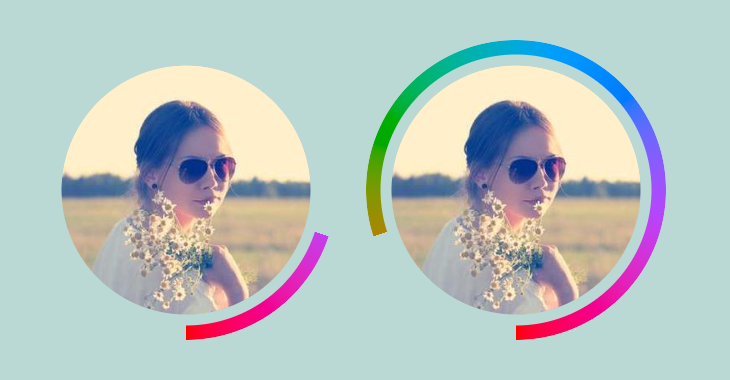
Rounded gradient border with hover effect
Add a fancy hover effect to your image with a gradient border
- No extra element (only the
<img>tag) - No pseudo-element
- Powered by CSS mask & @property
@property --h {
  syntax: "<percentage>";
  initial-value: 0%;
  inherits: true;
}

img {
  --b: 15px; /* border width */
  --g: 10px; /* gap */
  --c: red;

  border-radius: 50%;
  padding: calc(var(--b) + var(--g));
  background: conic-gradient(from 180deg in oklch longer hue, red 0 0);
  mask:
    radial-gradient(farthest-side,
      #000  calc(100% - var(--b) - var(--g) - 1px),
      #0000 calc(100% - var(--b) - var(--g))
            calc(100% - var(--b)),
      #000  calc(100% - var(--b) + 1px)),
    conic-gradient(from 180deg,
     #0000   calc(var(--p) - var(--h)),
     #000  0 var(--p),
     #0000,
     #000  0 calc(var(--p) + var(--h)),
     #0000 0),
    linear-gradient(#000 0 0) content-box;
  mask-composite: intersect,add;
  --p: 0%;
  transition: --h .5s linear,scale .5s;
}
img:hover {
  --h: 100%;
  --p: 100%;
  scale: 1.1;
}
See the Pen Fancy gradient border with hover effect by Temani Afif (@t_afif) on CodePen.
More CSS Tips
- Infinite shadow for your images II CSS trick to add a diagonal infinite shadow to your image.
- Overlay reveal animation for your images a fancy reveal animation using only one element.
- Add a 3D style to your text II Add a touch of 3D to your text with some gradient tricks.
- Add a 3D style to your text Add a touch of 3D to your text with some gradient tricks.