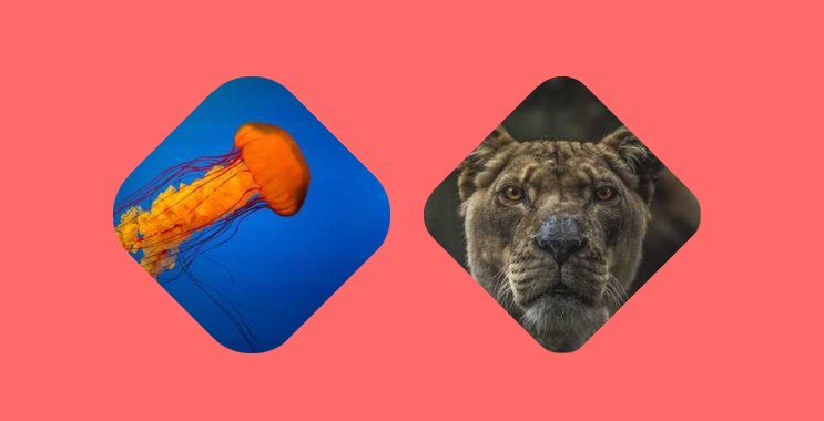
A Rhombus shape with rounded corners
Transform your image into a Rhombus shape with rounded corners using a few lines of code
- No extra element (only the
<img>tag) - No pseudo-element
- Optimized with CSS variables
img {
  --r: 50px; /* the radius */

  width: 250px; /* the image size */
  aspect-ratio: 1;
  margin: calc(tan(22.5deg)*var(--r));
  clip-path: polygon(50% 0,100% 50%,50% 100%,0 50%) margin-box;
  --_g:/calc(2*var(--r)) calc(2*var(--r))
    radial-gradient(#000 70%,#0000 72%);
  --_s:calc(100% - (1 - tan(22.5deg))*var(--r));
  mask:
    conic-gradient(#000 0 0) no-repeat 50%/var(--_s) var(--_s),
    top var(--_g) no-repeat space,left var(--_g) space no-repeat;
}
See the Pen Rhombus image with rounded corner by Temani Afif (@t_afif) on CodePen.
More CSS Shapes: css-shape.com
More CSS Tips
- Sliding reveal animation for your images A cool reveal effect on hover with a sliding animation.
- Color your image with a sliding hover effect Reveal the color of a black & white image using a simple code.
- Transform a 2D image into a 3D one A few lines of code to transform your image into 3D.
- 3D parallax effect on images A fancy 3D hover effect to your image with a simple code.