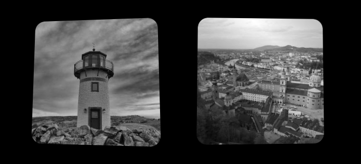
3D shine effect on hover
Add a 3D effect to your image with a shiny animation on hover ✨
- No extra element (only the
<img>tag) - No pseudo-element
- Less than 10 CSS declrations
img {
  --a: 8deg; /* control the angle of rotation (the smaller, the better) */
  aspect-ratio: 1;
  transform: perspective(400px) rotate3d(var(--i,1,-1),0,var(--a));
  mask:
    linear-gradient(135deg,#000c 40%,#000,#000c 60%)
    100% 100%/240% 240%;
  transition: .4s;
}
img:hover {
  --i:-1,1;
  mask-position: 0 0;
}
See the Pen 3D Shine effect on hover by Temani Afif (@t_afif) on CodePen.
More detail: smashingmagazine.com/2023/07/shines-perspective-rotations-css-3d-effects-images
More CSS Tips
- Slow down a rotation on hover A simple trick to reduce the speed of your rotating element.
- Sliding reveal animation for your images A cool reveal effect on hover with a sliding animation.
- Add a gradient overlay using border-image One line of code to add a gradient overlay above your background.
- Transform a 2D image into a 3D one A few lines of code to transform your image into 3D.