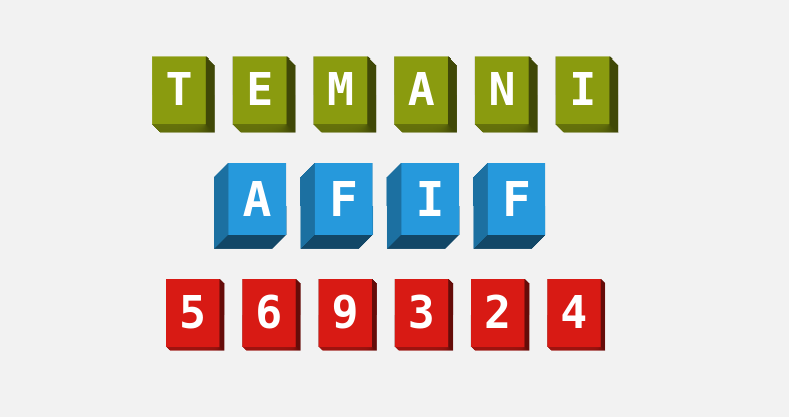
Add a 3D style to your text III
Add a cool 3D effect to your name or your favorite number
- Only one element per word (not per letter)
- No pseudo-elements
- Optimized with CSS variables
h2 {
  --s: .4em; /* space between boxes*/
  --d: .2em; /* the depth */
  --p: .3em; /* the inline padding */

  font-family: monospace; /* only for monospace font */
  line-height: 1.5; /* control the height of the boxes */
  letter-spacing: calc(var(--s) + var(--d) + 2*var(--p));
  padding-left: var(--p);
  padding-bottom: var(--d);
  clip-path: inset(0 calc(var(--p) + var(--s)) 0 0);
  --_g:calc(1ch + var(--s) + var(--d) + 2*var(--p));
  background:
    conic-gradient(at calc(100% - var(--d) - var(--s)) calc(100% - var(--d)),
                    #0008 37.5%,#0004 75%,#0000 0) 0 0/var(--_g) 100%
    #8A9B0F; /* the main color */
  mask:
    conic-gradient(from -45deg at calc(100% - var(--s)) var(--d),#0000 62.5%,#000 0)
     0 0/var(--_g) 50% repeat-x,
    conic-gradient(at var(--s) calc(100% - var(--d)),#000 37.5%,#0000 0)
     calc(-1*var(--s)) 100%/var(--_g) 50% repeat-x;
}
See the Pen CSS-only 3D letters by Temani Afif (@t_afif) on CodePen.
More CSS Tips
- Border with inner radius for your images Two lines of code to add an inner radius to your images.
- Circular list of stacked avatars Create a list of stacked avatars with a nice hover effect.
- Place your image inside a 3D gift box A cool 3D effect to create an image gift box.
- A circular reveal effect for your images A few lines of code to create a fancy reveal effect on images.