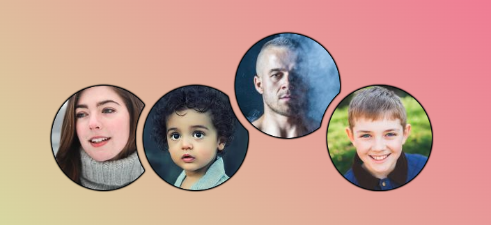
Horizontal list of stacked avatars
Create a list of stacked avatars with a cool hover effect and with transparency
- Minimal HTML (images inside a container)
- Works with any number of images
- Powered by modern CSS (CSS variables, mask, @property, has() selector and more)
@property --h {
  syntax: "<length-percentage>";
  initial-value: 0%;
  inherits: true;
}
@property --t {
  syntax: "<length-percentage>";
  initial-value: 0%;
  inherits: true;
}

.container {
  --s: 150px; /* image size*/
  --o: 30px;  /* the overlap */
  --g: 12px;  /* the gap */

  display: flex;
  gap: var(--g);
  padding: 3px; /* a small padding to make room for the shadow */
  clip-path: inset(0);
  transition: 0s .6s;
  filter: drop-shadow(0 0 1px #000) drop-shadow(0 0 1px #000) drop-shadow(0 0 #000) drop-shadow(0 0 #000);
}
.container img {
  height: var(--s);
  aspect-ratio: 1;
  border-radius: 50%;
  border-block: var(--s) solid #0000;
  margin-block: calc(-1*var(--s));
  translate: 0 var(--t);
  transition: --h .6s,--t .6s;
}
.container img:not(:last-child) {
  margin-right: calc(-1*var(--o));
  mask: radial-gradient(50% 50% at
    calc(150% + var(--g) - var(--o)) calc(50% - var(--h)),
    #0000 calc(100% + var(--g)),#000 calc(101% + var(--g)))
    padding-box;
}
.container:hover {
  clip-path: inset(-999px 0 0);
  transition: 0s;
}
img:hover {
  --h: calc(-.7*var(--s));
  --t: calc(-.7*var(--s));
}
img:has(+ img:hover) {
  --h: calc( .7*var(--s));
}
See the Pen Stacked Avatars with hover effect by Temani Afif (@t_afif) on CodePen.
More CSS Tips
- Fancy corner decoration for your images A few lines of code for a cool corner decoration.
- Border with inner radius for your images Two lines of code to add an inner radius to your images.
- Place your image inside a 3D gift box II A cool 3D effect to create an image gift box.
- Place your image inside a 3D gift box A cool 3D effect to create an image gift box.