Circular list of stacked avatars
An horizontal list is good but a circular one is better 🤩
Another list of stacked avatars using the same code structure
- Minimal HTML (images inside a container)
- Works with any number of images
- Powered by modern CSS (CSS variables, mask, @property, and more)
- Optimized with Sass
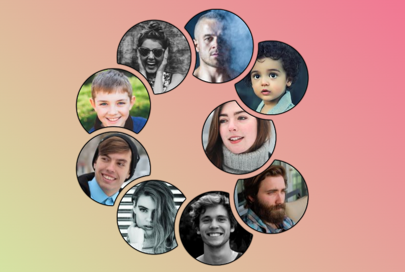
$n: 9; /* number of images*/

@property --h {
  syntax: "<length-percentage>";
  initial-value: 0%;
  inherits: true;
}
@property --m {
  syntax: "<length-percentage>";
  initial-value: 0%;
  inherits: true;
}
@property --t {
  syntax: "<length-percentage>";
  initial-value: 0%;
  inherits: true;
}

.container {
  --s: 150px; /* image size*/
  --o: 30px;  /* the overlap */
  --g: 12px;  /* the gap */

  --_d: calc(var(--s)/(2*sin(#{180/$n}deg)) - var(--o));
  display: grid;
  border-radius: 50%;
  width: calc(var(--s) + 2*var(--_d));
  aspect-ratio: 1;
  place-items: center;
  overflow: hidden;
  filter: drop-shadow(0 0 1px #000) drop-shadow(0 0 1px #000) drop-shadow(0 0 #000) drop-shadow(0 0 #000);
}
.container img {
  grid-area: 1/1;
  width: var(--s);
  aspect-ratio: 1;
  border-radius: 50%;
  transition: 1s;
  transition-property: --h ,--t,--m;
}
@for $i from 0 to $n {
  .container > img:nth-child(#{$i + 1}) {
    transform:
      rotate(#{-360*$i/$n}deg)
      translate(calc(var(--_d) - var(--t)))
      rotate(#{ 360*$i/$n}deg);
  mask: padding-box radial-gradient(50% 50% at
    calc(50% - (var(--_d) - var(--h))*cos(#{360*$i/$n}deg)
             + (var(--_d) - var(--m))*cos(#{360*($i + 1)/$n}deg))
    calc(50% + (var(--_d) - var(--h))*sin(#{360*$i/$n}deg)
             - (var(--_d) - var(--m))*sin(#{360*($i + 1)/$n}deg)),
    #0000 calc(100% + var(--g)),#000 calc(101% + var(--g)))
  }
}
img:hover {
  --t: var(--_d);
  --h: var(--_d);
  border: var(--_d) solid #0000;
  z-index: -1;
}
img:has(+ img:hover),
.container:has(img:first-child:hover) img:last-child{
  --m: var(--_d);
}
See the Pen Stacked Avatars with hover effect II by Temani Afif (@t_afif) on CodePen.
More CSS Tips
- Fix your images with an adhesive tape A fancy effect using only the image element and a few lines of code.
- Fancy corner decoration for your images A few lines of code for a cool corner decoration.
- Add a 3D style to your text III Add a touch of 3D to your text with some gradient tricks.
- Place your image inside a 3D gift box II A cool 3D effect to create an image gift box.