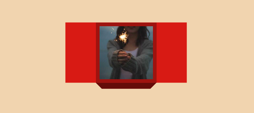
Place your image inside a 3D gift box II
Here is another variation of the previous effect. Now you can open the gift box from both sides 🎁
Still using only the <img> tag (No extra elements, No pseudo-elements) and a touch of magic 🪄
@property --h {
  syntax: "<length>";
  initial-value: 0px;
  inherits: true;
}

img {
  --w: 200px; /* image size */
  --b: 12px;  /* the border */
  --d: 20px;  /* the depth */
  --c: #d81a14;

  width: var(--w);
  aspect-ratio: 1;
  --h: calc(var(--w)/2);
  padding: var(--b) max(var(--h),var(--b));
  box-sizing: border-box;
  object-fit: cover;
  object-position: center;
  background:
    linear-gradient(#0004 0 0) no-repeat
     50%/0% 100% var(--c) border-box;
  clip-path: polygon(calc(var(--h) - var(--w)/2) 0,calc(100% + var(--w)/2 - var(--h)) 0,calc(100% + var(--w)/2 - var(--h)) 100%,100% 100%,calc(100% - var(--d)) calc(100% + var(--d)),var(--d) calc(100% + var(--d)),0 100%,calc(var(--h) - var(--w)/2) 100%);
  box-shadow:
    0 var(--d) #0008,
    0 0 0 999px var(--c);
  transition: .6s linear;
  transition-property: --h,background-size;
}
img:hover {
  background-size: 100% 100%;
  --h: 0px;
}
See the Pen Image gift box II (hover to reveal) by Temani Afif (@t_afif) on CodePen.
More CSS Tips
- Circular list of stacked avatars Create a list of stacked avatars with a nice hover effect.
- Horizontal list of stacked avatars Create a list of stacked avatars with a nice hover effect.
- A circular reveal effect for your images A few lines of code to create a fancy reveal effect on images.
- Infinite stripes shadow for your images Add an infinite shadow with stripes to your image.