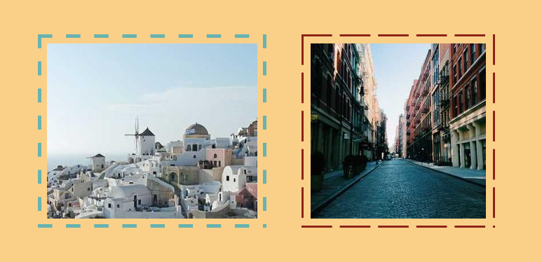
Border reveal animation on hover
Add a simple border around your image with a nice hover effect
- No extra element (only the
<img>tag) - No pseudo-elements
- Only 3 Gradients
- Less than 15 CSS declarations
@property --p {
  syntax: "<percentage>";
  initial-value: 0%; /* you can start at 50% for a different effect */
  inherits: true;
}

img {
  --t: 5px;  /* control the thickness */
  --s: 40px; /* control the size of the dash  */
  --g: 8px;  /* control the gap */
  --c: #68B3AF;

  padding:
    calc(var(--g) + var(--t)) var(--g)
    var(--g) calc(var(--g) + var(--t));
  border: solid #0000;
  border-width: 0 var(--t) var(--t) 0;
  background:
    conic-gradient(at var(--p) var(--p), #0000 75%,var(--c) 0)
     0 0/var(--s) var(--s) round padding-box border-box;
  mask:
    conic-gradient(
      from 90deg at calc(2*var(--t)) calc(2*var(--t)),
      #0000 25%,#000 0) calc(-1*var(--t)) calc(-1*var(--t)),
    linear-gradient(#000 0 0) content-box;
  transition: --p .6s;
}
img:hover {
   --p: 100%;
}
See the Pen Border Reveal on hover by Temani Afif (@t_afif) on CodePen.
More CSS Tips
- Starburst images with rotation Use clip-path to turn your image into a starburst shape.
- Infinite shadow for your images a small code to create an infinite shadow in any direction.
- Zig-Zag separation between images with hover effect A fancy image separation with zig-zag shapes and cool hover effect.
- A Fancy Hover Effect For Your Avatar II Create a stunning "Pop out" hover effect using modern CSS.