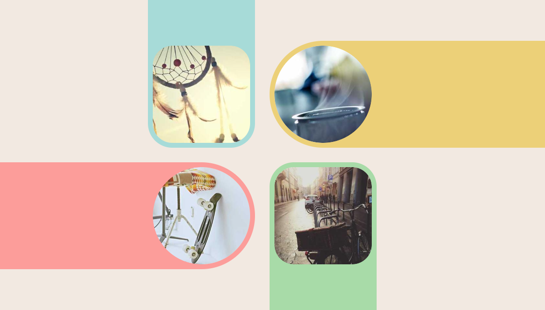
Infinite shadow for your images
Add an infinite shadow to your image in any direction using a few lines of code
- No extra element (only the
<img>tag) - No pseudo-elements
- Only 2 CSS properties
- Works with rounded corners
img {
  --c: #A7DBD8;
  --s: 10px; /* the border thickness*/

  border-radius: 50%; /* works with any value or without */
  outline: var(--s) solid var(--c);
  --_c: conic-gradient(var(--c) 0 0);
}
.top {
  border-image: var(--_c) 1 0 0 0/50% 0/100vh var(--s);
}
.bottom {
  border-image: var(--_c) 0 0 1 0/50% 0/100vh var(--s);
}
.right {
  border-image: var(--_c) 0 1 0 0/0 50%/var(--s) 100vw;
}
.left {
  border-image: var(--_c) 0 0 0 1/0 50%/var(--s) 100vw;
}
See the Pen Infinite image shadow by Temani Afif (@t_afif) on CodePen.
Related: smashingmagazine.com/2024/01/css-border-image-property/
More CSS Tips
- A Fancy Hover Effect For Your Avatar III Create a stunning "Pop out" hover effect using modern CSS.
- Slanted underline with hover effect A simple code to add a slanted underline to your text.
- Border reveal animation on hover A nice animation to reveal your border on hover.
- Fancy frame for your image with hover effect A nice looking frame around your image with a cool hover effect.