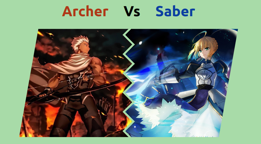
Zig-Zag separation between images with hover effect
Place 2 images next to each other with a Zig-Zag separation ⚡️
- Minimal HTML code
- Less than 25 CSS declarations
- Optimized with CSS variables
- Nice hover effect
Zig-Zag edge generator 👉 css-generators.com/custom-borders
.gallery {
  --z: 32px;  /* control the zig-zag  */
  --s: 360px; /* control the size */
  --g: 8px;   /* control the gap */

  display: grid;
  gap: var(--g);
  width: calc(2*var(--s) + var(--g));
  grid-auto-flow: column;
}
.gallery > img {
  width: 0;
  min-width: calc(100% + var(--z)/2);
  height: var(--s);
  mask: var(--mask);
}
.gallery > img:hover {
  width: calc(var(--s)/2);
}
.gallery > img:first-child {
  place-self: start;
  clip-path: polygon(calc(2*var(--z)) 0,100% 0,100% 100%,0 100%);
  --mask:
    conic-gradient(from -135deg at right,#0000,#000 1deg 89deg,#0000 90deg)
      50%/100% calc(2*var(--z)) repeat-y;
}
.gallery > img:last-child {
  place-self: end;
  clip-path: polygon(0 0,100% 0,calc(100% - 2*var(--z)) 100%,0 100%);
  --mask:
    conic-gradient(from   45deg at left ,#0000,#000 1deg 89deg,#0000 90deg)
      50% calc(50% - var(--z))/100% calc(2*var(--z)) repeat-y;
}
See the Pen Zig-zag border & cool hover effect by Temani Afif (@t_afif) on CodePen.
More detail: css-tricks.com/css-grid-and-custom-shapes-part-2
More CSS Tips
- Fancy circular hover effect A nice animation of rotating circles on hover.
- Border reveal animation on hover A nice animation to reveal your border on hover.
- A Fancy Hover Effect For Your Avatar Create a stunning "Pop out" hover effect using modern CSS.
- A reveal hover effect using CSS mask III Use CSS mask to create a nice reveal effect on hover.