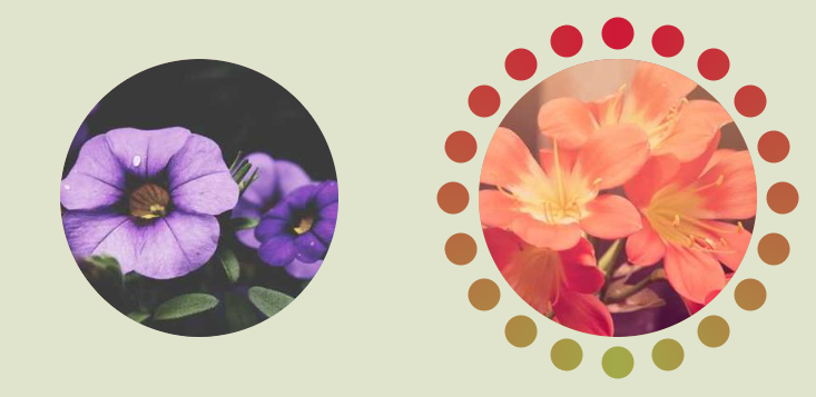
Fancy circular hover effect
Create a fancy hover effect with small circles rotating around your image.
- No extra element (only the
<img>tag) - No pseudo-elements
- Powered by CSS Mask and
@property - Optimized with Sass
$n: 20; /* number of small circles */

@property --n {
  syntax: "<number>";
  initial-value: 0;
  inherits: true;
}
@property --i {
  syntax: "<length>";
  initial-value: 0px;
  inherits: true;
}
@property --a {
  syntax: "<angle>";
  initial-value: 0deg;
  inherits: true;
}

img {
  --r: 30px; /* control the small circles size  */
  --g: 8px; /* the gap */
  --c: #355C7D,#F8B195,#C06C84; /* the gradient coloration */

  width: 250px;
  aspect-ratio: 1;
  --i: calc(var(--g) + var(--r));
  --n: 200;
  --a: 72deg;
  padding: calc(var(--g) + var(--r));
  border-radius: 50%;
  $m: ();
  @for $i from 1 through ($n) {
    $m: append($m,
         radial-gradient(50% 50%,var(--c) calc(100% - 1px),#0000) no-repeat
          calc(50% + (50% - var(--i))*cos(360deg*#{$i}/(#{$n} + var(--n)) + var(--a)))
          calc(50% + (50% - var(--i))*sin(360deg*#{$i}/(#{$n} + var(--n)) + var(--a)))/
          var(--r) var(--r),
        comma);
   }
  mask: linear-gradient(#000 0 0) content-box,$m;
  background: conic-gradient(var(--c) 0,var(--c));
  cursor: pointer;
  transition: --i .3s .4s, --n .4s ease-in,--a .4s;
}
img:hover {
  --i: 0px;
  --n: 0;
  --a: 90deg;
  transition: --i .3s, --n .4s .3s, --a .4s .3s;
}
See the Pen fancy circular hover effect by Temani Afif (@t_afif) on CodePen.
More CSS Tips
- Slanted underline with hover effect A simple code to add a slanted underline to your text.
- Starburst images with rotation Use clip-path to turn your image into a starburst shape.
- Fancy frame for your image with hover effect A nice looking frame around your image with a cool hover effect.
- Zig-Zag separation between images with hover effect A fancy image separation with zig-zag shapes and cool hover effect.