Let's Reshape the Web using border-shape!
To create CSS Shapes, I mainly rely on clipping (using clip-path) or masking (using mask). Both are very powerful and can be used to create all the possible shapes. However, they are limited if we want to add decorations such as borders and shadows.
The corner-shape property is a good alternative that allows us to create CSS shapes with decorations. However, since it's only about shaping the corners, it remains limited to a subset of shapes.
Another alternative is the new and powerful border-shape.
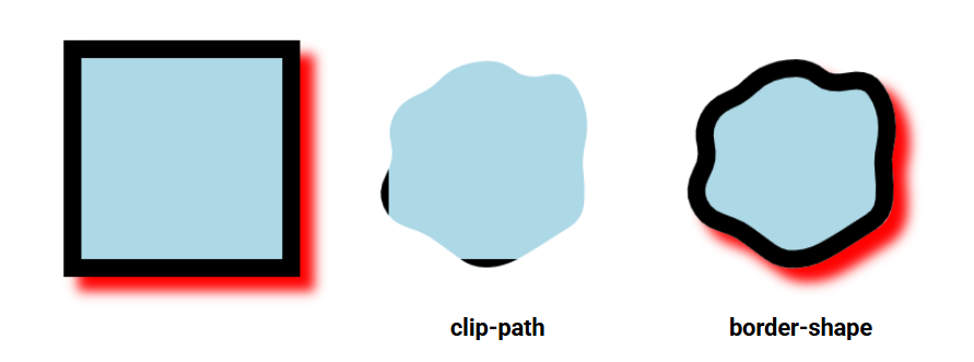
border-shape doesn't perform clipping or masking; it "shapes" the whole element, including its decorations (borders, shadows, and outlines). And guess what? It takes the same values as clip-path (polygon(), shape(), inset(), circle(), etc.). You don't have to learn something new, use border-shape instead of clip-path and see the magic in action!
.shape {
  /* Old code */
  clip-path: shape() | polygon() | circle() | ...;
  /* New code */
  border-shape: shape() | polygon() | circle() | ...;
}
It's Chrome-only for now (starting from V147)
See the Pen Say hello to border-shape by Temani Afif (@t_afif) on CodePen.
Will clip-path and mask become obsolete? #
Not really. mask is useful for shapes that have a repeating pattern since it relies on gradients, and clip-path is useful when you want to clip/hide part of an element or create reveal effects. Consider border-shape if you want to create static shapes with decorations. Otherwise, you can keep using the old methods.
Here are a few examples of shapes taken from my CSS Shapes collection, where I am simply replacing clip-path with border-shape
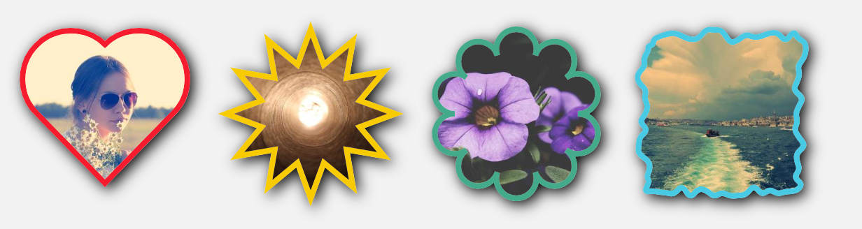
See the Pen Shapes with border-shape by Temani Afif (@t_afif) on CodePen.
Some of my generators are also updated to provide a border-only version using border-shape.
That's all for now, but stay tuned for more advanced usage and fancy demos with border-shape!
More CSS Tips
- The Sticky Header that Sticks! Another fancy effect powered by scroll-driven animation and shape().
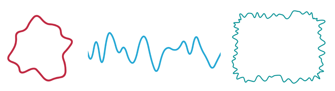
- Hand-Drawn Underline using border-shape Add a fancy underline to your menu items using modern CSS.
- CSS-only Chrome Dino Game Recreating the famous Dino game by Google using pure CSS, and playable with the keyboard.
- The Gotcha of using counter() with container counter() may behave strangely when combined with container. Learn about this small quirk.