Complex border-only Shapes with Gradient Coloration
You can combine border-shape and border-area to easily border-only shapes with gradient coloration easily. No more hacks or complex code, just 3 lines and you're done!
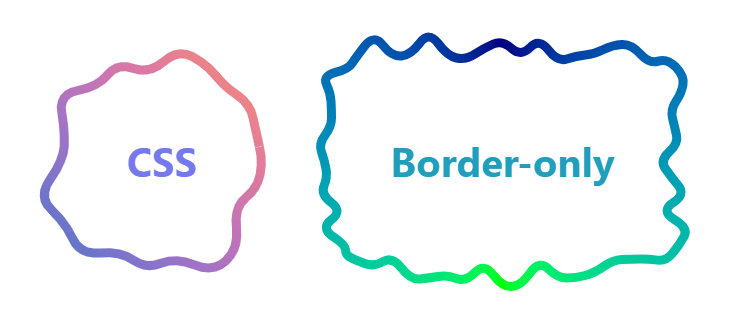
.shape-gradient {
  border: 10px solid #0000; /* a transparent border */
  border-shape: shape() | polygon() | etc; /* the  shape */
  background: linear-gradient(#0077b6,#f4a261) border-area; /* gradient + border-area */
}
⚠️ Chromium-only for now ⚠️
See the Pen Complex border-only gradient shapes by Temani Afif (@t_afif) on CodePen.
More CSS Tips
- Get Grid Information using pure CSS II Retrieving the position of randomly placed items using only CSS.
- Hover Proximity with Scroll-Driven Animations A fancy hover effect in a 2D responsive grid powered by modern CSS.