Heart shape animation using outline
Add a beautiful animation to a Heart shape and reveal your best images 🥰 😍
- No extra element (only the
<img>tag) - No pseudo-element
- Less than 10 declarations
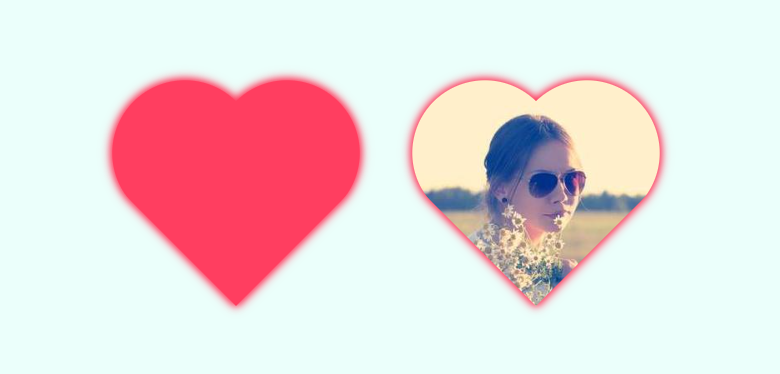
img {
  width: 250px;
  aspect-ratio: 1;
  object-fit: cover;
  mask-border: radial-gradient(#000 69%,#0000 70%) 84.5%/50%;
  clip-path: polygon(-41% 0,50% 91%, 141% 0);
  outline: 100vmax solid #ff3e60;
  outline-offset: -100vmax;
  transition: .7s;
}
img:hover {
  outline-color: #0000;
}
See the Pen CSS only heart hover effect by Temani Afif (@t_afif) on CodePen.
Related Article: verpex.com/blog/website-tips/css-shapes-the-heart
More CSS Tips
- CSS-only back to top button A few CSS trick to create a back to top button.
- Navigation menu with sliding items A simple navigation menu with a cool sliding effect for the items.
- Horizontal lines around your title Use border-image to create Horizontal lines around a title.
- Float an element to the bottom corner Use shape-outside to place an element on the bottom corner.