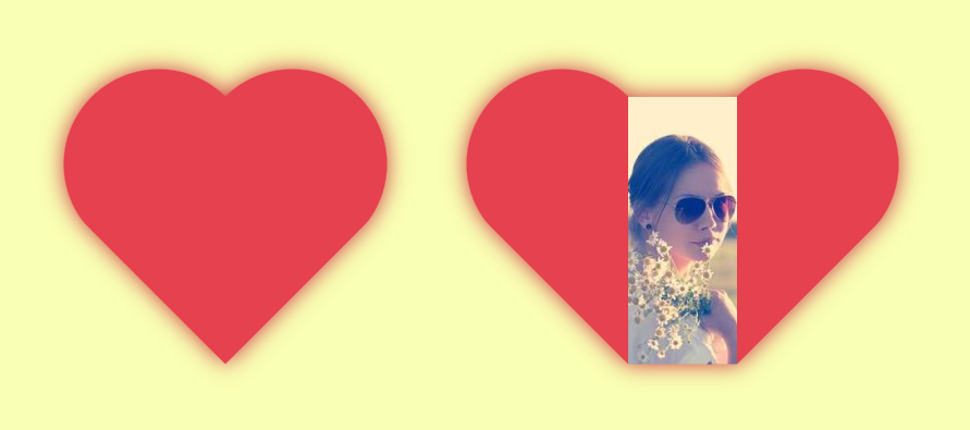
Heart shape with a sliding hover effect II
Another variation of the previous effect using the same code structure
- No extra element (only the
<img>tag) - No pseudo-elements
img {
  --s: 300px; /* image size */

  width: var(--s);
  aspect-ratio: 1;
  padding: calc(.09*var(--s)) calc(var(--s)/2 - var(--_p));
  box-sizing: border-box;
  object-fit: cover;
  border-image:
    radial-gradient(#e5414e 69%,#0000 70%)
    84.5%/calc(var(--s)/2)/0 var(--_p);
  clip-path: polygon(
    calc(-41% - var(--_p)) 0,
    calc(50%  - var(--_p)) 91%,
    calc(50%  + var(--_p)) 91%,
    calc(141% + var(--_p)) 0);
  transition: .5s;
  --_p: 0px;
}
img:hover {
  --_p: calc(var(--s)/2);
}
See the Pen Heart shape image reveal II ❤️ by Temani Afif (@t_afif) on CodePen.
More CSS Tips
- CSS Functions that work without arguments Some functions in CSS don't require arguments and it can be helpful.
- Create a flower shape using CSS mask Use an online generator to create a fancy flower shape using mask.
- Create a triangle shape with 2 CSS properties Only two CSS properties to create a triangle shape.
- Responsive full-screen slanted coloration three CSS proeprties for a fancy full width responsive coloration.