An Interactive Image Slider/Carousel
I am combining the technique of making an infinite marquee animation with the speed control trick to create a responsive image slider with button controls. A CSS-only implementation that works with any number of images. Powered by modern CSS features such as shape(), sibling-index()/count(), animation-composition, etc.
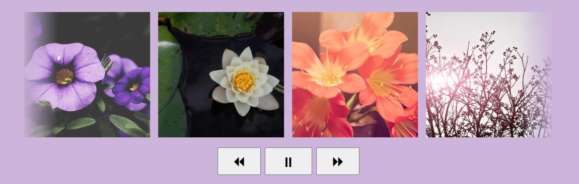
<div class="container">
  <img src="">
  <img src="">
  <!-- add as many images as you want -->
</div>
<div class="controls">
  <button aria-label="rewind"> ⏪︎ </button>
  <button aria-label="pause"> ⏸ </button>
  <button aria-label="fast forward"> ⏩︎ </button>
</div>
.container {
--w: 250px; /* size of the image */
--d: 15s; /* animation duration */
--n: 4; /* number of visible images */
display: flex;
overflow: hidden;
}
img {
width: var(--w);
offset: shape(from calc(var(--w)/-2) 50%,hline by calc(sibling-count()*max(100%/var(--n),var(--w) + 10px)));
animation:
x linear infinite var(--d) calc(-1*sibling-index()*var(--d)/sibling-count()),
x linear infinite calc(var(--d)/2) paused,
y linear infinite calc(var(--d)/4) paused;
animation-composition: add;
}
.container:has(+ .controls button:nth-child(1):active) img {
animation-play-state: running, paused, running;
}
.container:has(+ .controls button:nth-child(2):active) img {
animation-play-state: paused;
}
.container:has(+ .controls button:nth-child(3):active) img {
animation-play-state: running, running, paused;
}
@keyframes x {
to {offset-distance: 100%}
}
@keyframes y {
to {offset-distance: -100%}
}See the Pen Interactive Image Slider by Temani Afif (@t_afif) on CodePen.
More details: How to Control Infinite CSS Animations
More CSS Tips
- Bending a Straight Line using Modern CSS Using border-shape and anchor positioning to create a bending line between two circles.
- Connecting Circles With a Curved Line Using border-shape and anchor positioning to create a connection between two circles.
- The Lazy Tooltip Follower A fun demo illustrating a tooltip that follows its anchor, but slowly.
- The Sticky Header that Sticks! Another fancy effect powered by scroll-driven animation and shape().