Connecting Circles With a Curved Line
Reusing the previous implementation to transform the arrow shape into a curved line. The line's curve adjusts based on the distance and positions of the circles.
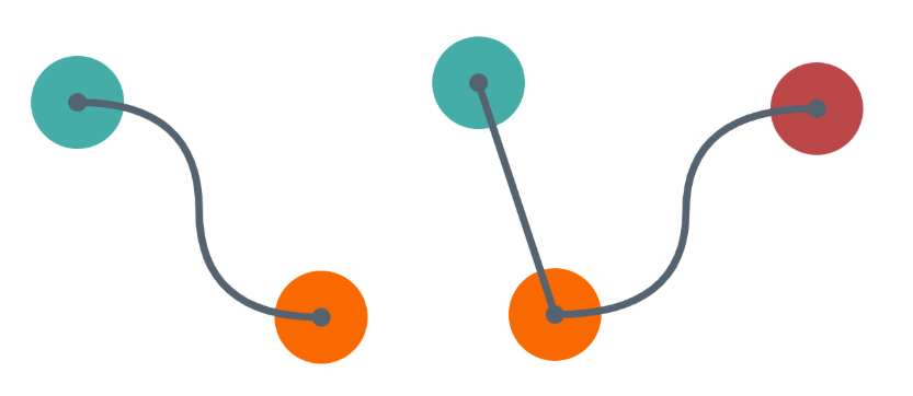
A CSS-only implementation powered by the future of CSS (Anchor Positioning, shape(), border-shape, if(), and more).
The HTML code is still the same:
<div class="circle" name="--a" ></div>
<div class="circle" name="--b" ></div>

<div class="link" x="--a" y="--b">
  <a></a><b></b><c></c><d></d>
</div>
And the relevant CSS code is relatively small:
.link {
  --b: 10px; /* line thickness */
  --x: attr(x type(<custom-ident>));
  --y: attr(y type(<custom-ident>));
}
.link * {
  position: absolute;
  --_x: calc(anchor(var(--x) inside) + anchor-size(var(--x))/2 - .1px);
  --_y: calc(anchor(var(--y) inside) + anchor-size(var(--y))/2);
  container-type: size;
}
.link :is(a,b) {top:  var(--_x); bottom: var(--_y)}
.link :is(a,c) {left: var(--_x); right:  var(--_y)}
.link :is(c,d) {top:  var(--_y); bottom: var(--_x)}
.link :is(b,d) {left: var(--_y); right:  var(--_x)}
.link *:before {
  content: "";
  position: absolute;
  inset: calc(-1*var(--b));
  border: var(--b) solid #556270;
  opacity: calc(sign(1cqw)*sign(1cqh));
  border-shape: shape(from 0 0,curve to 50% 50% with if(
    style((100cqw < 200px) or (100cqh < 200px)): 0;
    style((100cqw > 400px)): 40%;
    else: 50%) 0,smooth to 100% 100%) padding-box;
}
.link b {scale: -1  1}
.link c {scale:  1 -1}
.link d {scale: -1 -1}
Drag the circles in the demo below and see how the shape of the line updates:
⚠️ Chrome-only for now ⚠️
See the Pen Connected circles with a curved line by Temani Afif (@t_afif) on CodePen.
You can have as many circles/links as you want.
See the Pen Connected circles with a curved line II by Temani Afif (@t_afif) on CodePen.
More CSS Tips
- Wiggly/Wavy Input Range Slider Say goodbye to the boring straight range slider and say hello to the fancy wiggly range slider.
- Dynamic Node Connection (CSS-only Diagram) Create a graph/diagram with different nodes and connections, all made with pure CSS.
- An Interactive Image Slider/Carousel Using modern CSS to create a responsive image slider with speed control.
- Control the Speed of Infinite Animations A simple code to easily control the speed of any infinite animation.