Three Shape Variations using border-shape
Using shape(), you can easily create any CSS-only shapes, and if you combine it with border-shape, you can have the border-only and cutout variations using almost the same code structure.
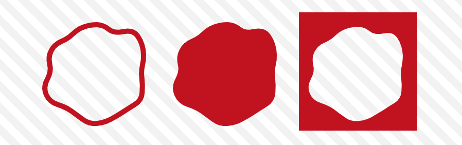
You can get the main shape by simply using border-shape and background:
.shape {
  border-shape: shape(/* you shape code */);
  background: #c1121f; /* you can also have a gradient  */
}
To get the border-only version, you use border instead of background:
.border-only {
  border-shape: shape(/* you shape code */);
  border: 10px solid #c1121f;
}
To get the cutout version, add inset(0) to the previous code.
.cutout {
  border-shape: inset(0) shape(/* you shape code */);
  border: 10px solid #c1121f;
}
border-shape accepts two shape values. In such a case, the border is rendered as the area between the two shapes. The first value defines the outer boundary, and the second value defines the inner boundary. By making the first shape a rectangle using inset(0), we get the cutout version!

⚠️ It's Chrome-only for now ⚠️
See the Pen Three shape variations using border-shape by Temani Afif (@t_afif) on CodePen.
Until better support, you can achieve the same using clip-path (except for the border-only version): Invert CSS Shapes using shape()
More CSS Tips
- Dynamic Node Connection (CSS-only Diagram) Create a graph/diagram with different nodes and connections, all made with pure CSS.
- Bending a Straight Line using Modern CSS Using border-shape and anchor positioning to create a bending line between two circles.
- Control the Speed of Infinite Animations A simple code to easily control the speed of any infinite animation.
- The Lazy Tooltip Follower A fun demo illustrating a tooltip that follows its anchor, but slowly.