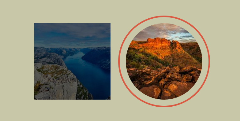
A fancy hover effect using outline
Add a cool hover effect to your images using a few lines of code
- No extra element (only the
<img>tag) - No pseudo element
- Using only the outline property
- Optimized with CSS variables
img {
  --s: 250px;   /* the size of the image */
  --b: 8px;     /* the border thickness*/
  --g: 14px;    /* the gap */
  --c: #4ECDC4; /* the color */

  width: var(--s);
  aspect-ratio: 1;
  outline: calc(var(--s)/2) solid #0009;
  outline-offset: calc(var(--s)/-2);
  transition: 0.3s;
}
img:hover {
  outline: var(--b) solid var(--c);
  outline-offset: var(--g);
}
See the Pen Frame hover effect with one element by Temani Afif (@t_afif) on CodePen.
More CSS Tips
- A CSS-only Zig-Zag edge Use CSS mask to create an easy to adjust Zig-Zag edge/border.
- A fancy title divider II Use clip-path and border-image to create a fancy title divider.
- Diagonal split & reveal animation Use clip-path to create a nice hover effect to reveal images.
- A CSS-only Speech Bubble Use CSS mask to create a speach bubble easy to adjust.