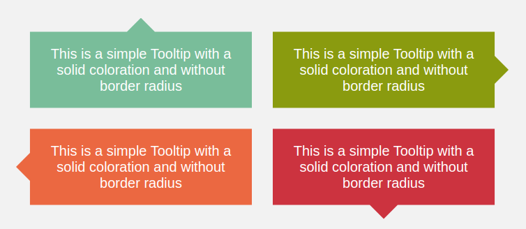
A Tooltip Shape using 2 CSS properties
The smallest code to create a simple Tooltip Shape
- One element (No pseudo-elements)
- Only 2 CSS Properties
- Optimized with CSS Variables
.tooltip {
  /* triangle dimension */
  --b: 2em; /* base */
  --h: 1em; /* height*/

  border-image: fill 0//var(--h)
    conic-gradient(#CC333F 0 0); /* the color  */
  clip-path:
    polygon(0 100%,0 0,100% 0,100% 100%,
      calc(50% + var(--b)/2) 100%,
      50% calc(100% + var(--h)),
      calc(50% - var(--b)/2) 100%);
}
See the Pen A simple Tooltip using 2 CSS properties by Temani Afif (@t_afif) on CodePen.
More Tooltip shapes: css-generators.com/tooltip-speech-bubble
More CSS Tips
- Overlay reveal animation for your images a fancy reveal animation using only one element.
- A Ribbon shape with a reveal hover effect A CSS-only ribbon shape with a fancy reveal effect on hover.
- Add a 3D style to your text Add a touch of 3D to your text with some gradients tricks.
- Responsive multi-line Ribbon Shape II A few gradients trick to create a responsive ribbon shape.