Sliding reveal animation for your images
Add a reveal effect to your image with a sliding animation on hover
- No extra element (only the
<img>tag) - No pseudo element
- Less than 10 CSS declarations
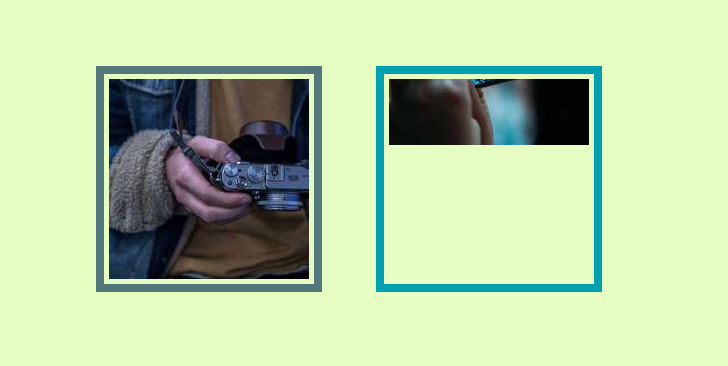
img {
  --s: 200px; /* the size of the image */

  width: var(--s);
  aspect-ratio: 1;
  box-sizing: border-box;
  object-fit: cover;
  /* 8px = thickness  13px = gap (5px) + thickness (8px) */
  border-image: linear-gradient(#53777A 0 0) 1/8px/13px;
  object-position: top;
  padding-top: calc(2*var(--s)/3);
  transition: .5s;
}
img:hover {
  padding: 0;
}
See the Pen Sliding reveal hover effect by Temani Afif (@t_afif) on CodePen.
More CSS Tips
- A CSS-only array of colors Create an array of colors and use an index to navigate.
- 3D shine animation with a hover effect a fancy 3D animation to your image with a cool hover effect.
- 3D shine effect on hover A fancy 3D effect with a shiny animation on hover.
- A Rhombus shape with rounded corners 3 lines of code to create a rhombus shape with rounded corners.